YouTube Thumbnail Tips to Boost Clicks and Increase Views 2026
Create powerful YouTube thumbnails that grab attention, increase views, and elevate your channel with these expert YouTube thumbnail tips.

One of the most frustrating challenges on YouTube is putting in all the hard work on a video, only to see it get barely any views. You might have great content, but if no one is clicking on your video, it’s hard to gain traction. Even with amazing videos, if your thumbnail isn’t grabbing attention, viewers won’t give your content a chance.
The solution lies in focusing on your thumbnail. It’s the first thing viewers see when scrolling through their feed, and if it doesn’t stand out, they’ll simply skip past it. A great thumbnail does more than look good. it generates curiosity, grabs attention, and entices viewers to click. A strong thumbnail leads to more views, as it’s the key to getting people to stop scrolling and click on your video. There are YouTube Faceless tools that you can use to make thumbnails.
What Are YouTube Thumbnails And Why Are They So Important?

YouTube thumbnails are the small preview images people see before clicking on your video. Think of them like mini movie posters. they’re the first impression your content makes, and they can make or break whether someone actually watches your video. Even if your content is amazing, a boring or confusing thumbnail will get ignored. If you can master YouTube thumbnails, then you can earn a lot from YouTube Automation.
Thumbnails matter more than most people realize. You could have a perfect title, but if the thumbnail doesn’t match the energy or curiosity that title creates, viewers will scroll past. The best thumbnails trigger emotion, surprise, curiosity, excitement, and give people a reason to click without feeling click baited.
Tips To Create A Good YouTube Thumbnail
Start with emotion. If you're using a face, exaggerate the expression. wide eyes, shocked looks, or intense stares pull people in. Don’t crowd the image with too many elements. Instead, zoom in on what matters most and keep the background clean so nothing distracts from the key focus.
Color contrast is your best friend. Make the subject pop by placing them against a bold, contrasting background. like a yellow hoodie on a purple background. Use text sparingly (3-5 words max), and choose fonts that are thick, clean, and readable even on small screens. Your goal is to catch attention instantly, not to explain everything in the image.
Use The Right Thumbnail Image Size

When you're making a YouTube thumbnail, size matters more than you might think. The best size to use is 1280 pixels wide by 720 pixels tall. This gives your image enough clarity to look good on all screen sizes: phones, laptops, and even TVs.
YouTube uses a rectangle shape called a 16:9 aspect ratio, so if your image doesn’t match that shape, it might get cut off or look weird. Always design your thumbnail in that size so it fits perfectly and looks clean everywhere.
Technical Specifications For YouTube Thumbnails

YouTube only accepts certain types of image files for thumbnails. The most common ones are JPG, PNG, and GIF. These are just different ways to save your image. PNG is great for clear, sharp images, especially if you have text or graphics. JPG is smaller in size and still looks good, but don’t over-compress it or it’ll get blurry.
You also need to keep your image under 2 megabytes (MB), which just means the file shouldn't be too heavy, or YouTube won’t let you upload it. Stick to the basics: clean image, right size, and saved in one of these formats.
How To Control The Thumbnail Image Quality
If your thumbnail looks blurry or pixelated, people won’t click. To keep the quality high, use a good-quality screenshot or image when you start. When editing, try not to add too many filters or effects. These can make the image look messy, especially when it's shrunk down.
Always save your image in high resolution, and if you're using an editing tool like Canva or Photoshop, export it in the best quality setting that still keeps it under 2MB. Before uploading, zoom out and see how it looks when it's small. if it's hard to read or unclear, simplify it.
Optimize For TV & Mobile

Most people watch YouTube on their phones, and a growing number are watching on big screens like smart TVs. That means your thumbnail needs to look good both up close and from far away. Use large, bold text that’s easy to read on small screens.
Don’t crowd the thumbnail with too many details. keep it focused and clear. If you’re showing a face, make sure it’s zoomed in enough to see the expression. A good test is to shrink the image down to about the size of your phone’s app icons. if it still grabs your attention, you’re doing it right.
Accurately Represent Your Video
Your thumbnail should reflect what your video is really about. If your thumbnail promises one thing but the video delivers something else, viewers will feel tricked and might click off quickly, which hurts your channel. Think of the thumbnail as a preview. it should set the right expectation so people are excited, not disappointed.
Use High-Quality Thumbnail Images
Blurry or low-resolution images make your video look unprofessional, even if the content is great. Always use sharp, clear images that look good even when small. If you're using a screenshot, try to take one with good lighting and focus. If you’re designing one from scratch, export it in high quality to keep it crisp.
Avoid Misleading Images And Titles

Clickbait might get people to click, but it won’t keep them watching. Misleading thumbnails can make viewers angry and ruin trust. Instead, find the most interesting or dramatic moment that actually does happen in your video, and use that. It’s about being exciting without being fake.
Use Screenshots From The First 15 To 30 Seconds
When you use a thumbnail that comes from early in the video, it helps create a smooth flow between what people see before clicking and what they see after. It also prevents confusion and makes the start of your video feel instantly familiar to the viewer, keeping them watching longer.
Use bright colors to grab attention

Bright colors stand out when someone is scrolling through a crowded homepage. Colors like red, yellow, and blue catch the eye, especially when used in backgrounds or to highlight key elements. Just don’t go overboard. pick one or two bold colors that fit your style and stick with them.
Use Contrasting Colors
Contrast helps things pop visually. For example, if your background is dark, use light text or subjects so they stand out clearly. Mixing opposite colors, like orange and blue or black and white, helps draw attention and makes your thumbnail easier to understand at a glance.
Make Thumbnails That POP
To make your thumbnail “pop,” focus on a strong central subject, use a clean background, and highlight key details with shadows or outlines. Adding a slight glow or border around important elements can also help them stand out. The goal is to create something that immediately jumps off the screen.
Show Close-Up Images
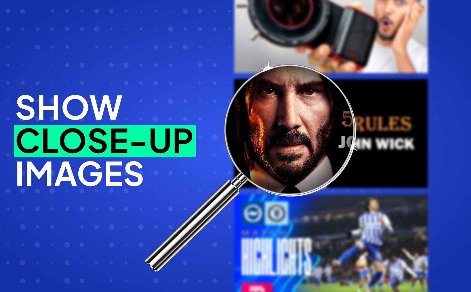
Zooming in on faces or objects gives your thumbnail more impact. A close-up shows emotion, detail, and makes the image feel more personal. Whether it’s a surprised face or a unique object, being close to the subject makes it easier for viewers to connect instantly.
Make An Emotional Connection With Thumbnails
People click on videos that make them feel something. curiosity, excitement, surprise, even fear. Use thumbnails that tell a mini story or hint at a strong emotion. When viewers feel connected before they even click, they’re more likely to watch all the way through.
Feature A Face Showing Emotion
A human face, especially with a strong expression, can grab attention fast. Whether it’s someone looking shocked, laughing, or confused, emotions pull people in because they’re relatable. If you can match the emotion in the thumbnail to the emotion in your video, that’s even better.
Get Action Shots
Action creates curiosity. A thumbnail with someone mid-jump, reacting to something, or caught in a dramatic moment makes viewers wonder what’s going on. Action shots are like freeze-frames from a movie trailer, they tease the best part without giving too much away.
Perfect The Thumbnail Text
Thumbnail text should be short, punchy, and add context to your title. Think of it like a hook that teases what’s inside without giving it all away.
Less Is More: Go Minimal With Text
When designing thumbnails for YouTube videos, one of the most important things to remember is that less text almost always leads to better results. A cluttered thumbnail filled with too many words can overwhelm the YouTube thumbnail viewer, especially on smaller devices where space is limited.
The goal isn’t to explain the whole video in the thumbnail, it’s to spark curiosity. Using just a few bold, impactful words helps your video stand out without looking messy or hard to read.
Make Your Title And Thumbnail Work Together

Thumbnails for YouTube videos work best when they team up with the video title to tell a story. The viewer only spends a second or two deciding what to watch next, so the title and thumbnail need to be aligned.
If they’re saying the same thing, it’s a wasted opportunity. But when they complement each other, when the thumbnail hints at something emotional or intriguing, and the title gives it context, it makes the viewer stop and want to know more.
Choose Readable Fonts
Use big, bold fonts that are easy to read on any screen, especially mobile. Avoid fancy or overly decorative fonts. they might look cool, but if viewers can’t read them in a second, they’ll scroll past. Stick to thick fonts with clear letters, and add a stroke or drop shadow to help the text stand out from the background.
Build A Brand Identity
Having a recognizable thumbnail style helps your channel look more professional and trustworthy. Whether it’s using the same font, color scheme, or layout, consistency builds familiarity. When people can spot your videos instantly in their feed, they’re more likely to click because they know what to expect.
Be Consistent With Your YouTube Thumbnails
Try using similar colors, fonts, and framing across all your thumbnails. This doesn’t mean every video has to look the same, but the style should feel connected. Think of your thumbnails like episodes of a show. Each one is unique, but they still belong to the same series.
Create A Template For Consistency
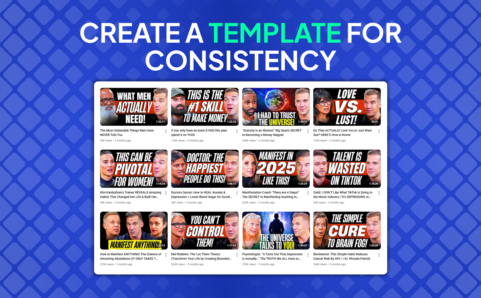
A thumbnail template saves time and keeps your style on point. You can make one in Canva, Photoshop, or any editor, with placeholders for text, faces, and background. This way, you don’t have to start from scratch every time, and you maintain a polished, consistent look that viewers recognize.
Test Thumbnail Variations
Sometimes the best way to find what works is to try different versions. A/B testing lets you compare two thumbnails and see which one gets more clicks. You can do this using the built-in AB testing feature on YouTube, or by switching thumbnails manually after a few hours and watching performance.
Test Out Different Designs
Don’t be afraid to experiment with styles. Try versions with and without text, different color schemes, or alternate facial expressions. What works for one audience or video type might not work for another. Over time, you’ll figure out what your viewers respond to best.
Remember, Change On YouTube Is Constant
What worked last year, or even last month, might not work today. YouTube’s algorithm and audience behavior are always evolving, so you need to stay flexible. Keep testing, keep learning, and don’t get stuck doing the same thing just because it used to work.
What Not To Do When Making A Thumbnail
Avoid clutter, tiny text, or visuals that are hard to understand. A thumbnail should make sense instantly. If someone has to squint or guess what it’s about, you’ve already lost their attention. Also, stay away from generic stock photos. they don’t tell a story and just blend in.
Beware The 1-Second Rule
Your thumbnail has one second to catch someone’s eye before they scroll past. If it doesn’t make an impact instantly, it won’t get clicked. That’s why bold colors, big faces, and simple text are so important. they hit fast and clearly.
Understand The 3-Zones of A Thumbnail
Every thumbnail has three key zones: the focus area (usually the center), the text area, and the background. Make sure the focus is clear and not covered by text. Spread out elements so they don’t all crowd into one spot, and avoid hiding important parts behind YouTube’s play button.
Beware The Bottom Right Corner of A Thumbnail
YouTube automatically adds the video length timestamp in the bottom right corner, which can cover part of your image. Never place text or important visuals there, or they’ll get blocked and make the design look messy.
Beware The Thumbnail Edges
On some devices, the edges of thumbnails get slightly cropped. So don’t put anything crucial, like text or faces too close to the edge. Keep a little space around the border to make sure nothing gets cut off and your design stays clean.
Types of Effective Thumbnails

The One-Question Format
A thumbnail that visually asks a question like someone pointing at a mystery object with a confused face, makes viewers curious. They want the answer, and the only way to get it is to click. Pair it with a title that teases the reveal.
Facts And Stats
Thumbnails with numbers or surprising data catch attention. Things like “$1 vs $10,000” or “99% of People Fail This” tap into people’s curiosity and make the video feel informative or shocking. Just make sure the fact is actually in the video.
Before And After Comparison
Show a side-by-side transformation. like a messy room vs a clean one, or someone overweight and then fit. People love seeing change, and this format tells a clear story with just one glance.
“Versus” Comparison

Thumbnails that show two things against each other, like “iPhone vs Android” or “Cheap vs Expensive” are super clickable. The contrast makes people want to know which one is better and why.
Quotes Or Sound Bites
If someone in your video says something powerful or wild, turn it into a thumbnail text. Put their face with the quote next to it, and people will want to know the full context. This works especially well for motivational videos, interviews, or storytelling content.
Clickbait Thumbnails: Do They Work?

Clickbait can work short term, but it’s risky. If the thumbnail over-promises and the video under-delivers, your audience retention drops and the algorithm punishes you. That said, a little drama or exaggeration can be effective, as long as it’s still truthful.
Shocked Expressions
Faces showing extreme emotions like shock, fear, or excitement grab attention fast. People are wired to notice human faces, and adding a reaction that matches the story can boost clicks. just don’t fake it if it’s not in the video.
Oversized Objects
Making an object bigger than normal in your thumbnail (like a massive burger or huge phone) can create curiosity. It gives a surreal vibe that makes viewers wonder, “What the heck is that?” This trick works best when the oversized thing actually appears in the video.
Intriguing Titles
Pairing a mysterious thumbnail with a title that makes people curious, like “He Shouldn’t Have Done That” or “They Didn’t See It Coming” gets clicks because people want to know the full story. Just make sure you deliver on the promise, or viewers won’t stick around.
Conclusion
Thumbnails for YouTube videos are like the first impression of your video. No matter how amazing your content is, if your thumbnail doesn’t grab attention, viewers won’t click on it. A great thumbnail needs to do more than just look nice. it has to quickly tell the viewer what the video is about and spark enough curiosity to make them want to watch. When your thumbnail and title work together, you’re giving your video the best shot at getting noticed in a sea of other content.
The key is to keep it simple and clean, use high-quality images, and be intentional with text and colors. Don’t forget to test different designs and make sure everything is clear, especially when it’s viewed on mobile. A bad thumbnail can seriously hurt your video’s chances, but when you put thought into it, your thumbnail becomes a powerful tool to get people to click and watch.
Frequently Asked Questions
What types of thumbnails are most effective?
“Before and After comparison” format, and the “facts/stats” format.
How important are custom thumbnails?
Very important. custom thumbnails boost CTR (click-through rate) and help your video stand out.
What are the best practices for designing thumbnails?
Use bright colors, readable fonts, close-up faces, and keep the design simple but eye-catching.
What technical specifications should be followed?
Use 1280x720 resolution, under 2MB, JPG or PNG format, and a 16:9 aspect ratio.